Cente Mobile UX/UI Design Case Study

Cente is a mobile UX/UI project I created that addresses the lack of money management tools for young couples. Every day we tell ourselves we’ll start eating at home to reduce costs, or save up for the things we really want. One way or another life gets in the way, causing damage to relationships when the money just doesn’t add up.
Overview
Tools & Techniques
- Figma
- User Interviews
- User Personas
- Competitive Analysis
- Market Research
- Design System
My Role
UX/UI Designer
The Problem
Young couples struggle to consistently budget and save together, with 60% wanting to improve but not knowing where to begin
The Gen Z generation lacks awareness and control when it comes to aligning their long-term financial goals with everyday shopping and recurring expenses
- 54% of Gen Zers feel spending regret about dining out and buying fast food, and 52% regret food delivery purchases
- 87% of respondents who say their marriage is “great” also say they work together to set long-term goals compared to only 41% who say their marriage is “okay” or “in crisis”
The Hypothesis
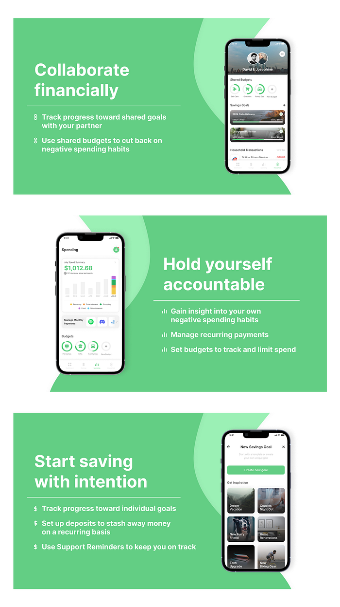
Couples with the goal of forming proper money habits, such as saving and budgeting, will need a solution to track progress and encourage accountability
Final Solution Preview

Research: User Interviews
Research participants described their ideal solution as “simple to track”, “on-the-go”, and “habit-forming” as opposed to “in-depth” or “complex”
Upon speaking with participants, it became more clear that younger users that lack financial literacy need a solution that simply builds their ability to form positive financial habits instead of bombarding them with complex charts and statistics. I asked them questions such as:
- How do you and your partner monitor progress toward financial goals?
- Describe the ways in which you actively set aside money on a recurring basis.
- In what ways, if any, have you and your partner tried to pursue better spending habits?
Research: Insights & Opportunities
Upon interviewing three participants ages 21–30, a handful of pain points began to stand out among the rest:
- Negative spending habits, such as eating out too often, make it difficult to save money toward goals
- Participants mentally track savings targets but fail to stay consistent over long periods of time (oftentimes making the simple mistake of forgetting)
- Sharing a bank account with a partner feels invasive, so financial goals often lack collaboration and transparency
Financial awareness, privacy, and buyer behavior are age-dependent factors that unconsciously guide users through their journey. For a middle-aged couple, sharing bank information is a more socially-acceptable activity, but for my user group, the lifespan of relationships can be shorter. So what does this mean? User intentions and expectations for their mobile experience will be noticeably different and should be approached in a way that intentionally connects with younger audiences.
Through research, I learned four core takeaways about our users:
1. Transparency, collaboration, and accountability are very important to couples looking to save.
2. Creative methods like “cash-first” are great ways to establish positive spending systems that users will likely stick with over long periods of time.
3. Visualizing goals makes saving more attractive.
4. Managing negative habits such as eating out too often or excessive online shopping drastically influences the degree of progress partners will experience in the long term.
How can we deliberately build solutions that are relevant to the user’s needs?
First, I got to know the users and investigated what kinds of pain points they encountered with existing solutions. Then, I used these pain points to extract key insights that would go on to inform my design opportunities. This was the start of a deep dive that turned the known problems upside down, and allowed me to ask myself questions like:
- How might we guide users toward better spending habits, and reward them for their progress?
- How might we encourage users to stay consistently aligned with their savings targets?
- How might we maintain privacy in a way that also allows for transparent collaboration toward financial goals?
Research: Competitive Analysis
Traditional solutions with too many graphs and data don’t appeal to the younger generation and come off as “intimidating” or “difficult to use” according to research participants

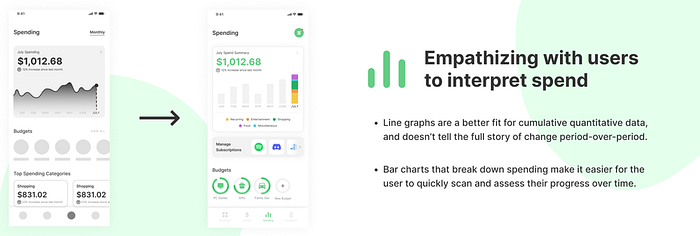
The best performers in the couples finance space are simple to use, visually compelling to young audiences, and actively investigate ways to satisfy user needs without creating an overwhelming experience. Simplicity is a key factor to notice here, and that’s because the younger audience is used to glancing, or scanning, as well as ‘set-and-forget’ mobile experiences.
Research: User Persona

Design: Early Challenges & Sketching
Before thinking critically about the constraints of my solution, I fell into the trap of overfitting the app with distracting features

A problem that I started to run into was focusing too much on the habit-forming and positive feedback that I lost sight of the simplicity users needed. This meant scrapping potential ideas that involved reward points, challenges, and similar features that could have been more distracting than beneficial.
Turning early sketches into effective experiences that align with user needs
After realigning with the larger goals at hand, I began to shave off unnecessary areas that I focused too much attention on. I reinstated the expected features any user would need to get their finances on track, then I took it a step further using the “Yes, but” method:
Does this allow the user to (Need):
- Stay on top of savings goals and monitor progress
- Maintain privacy but align financial goals with their partner
- Adopt better spending habits and reward them for their progress
Yes, but we can also look into (Areas of Exploration):
- Widget integration to keep savings goals top-of-mind
- Guided goals and checkpoints to reduce user fall-off rates (goals don’t have to be as binary as “complete” or “incomplete”)
- Providing a ‘Smart’ system that, for example, lets users accumulate small savings on each transaction and stores it away temporarily
However, not all of these ideas must be adopted. The key takeaway in this step is advancing the possibilities surrounding tangible user needs.
Design: Improvements & Solution


1. Branding and user experience are more intertwined than I expected: Branding is in the DNA of user experience. It’s the earliest touchpoint in the customer journey, and nailing it correctly can truly breathe life into the core components of a mobile application.
2. Context is king: In competitive landscapes, it’s important to remember that dynamic factors are operating in real-time. Even though competitive analysis was completed in the early phases of the project, those insights went on to change the course of my problem-solving process. An example of this approach is when I intentionally explored simple solutions as opposed to complex data visualization due to the nature of my target user. This allows me to use context in a way that drives progress toward relevant solutions.
